Agent Insights - In this edition of Agent Insights, Kevin Vitali, a Tewksbury MA Real Estate Agent servicing Northeastern Massachusetts, gives us some great tips to catch the attention of web surfers with eye-popping images for your real estate blog.
Its Time Your Blog Posts Got GRAPHIC!
 Let’s face it sensationalism sells! With so many options to choose from on the internet you need to grab a viewer’s attention. So, It’s Time Your Blog Posts Got GRAPHIC!!
So along with a snappy headline, don’t forget an eye catching blog graphic to go with your post. The graphic is equally if not more important than the headline itself.
How often are you scrolling thru your Facebook feed and a photo or graphic captures your attention and makes you want to click on the link and see what it is about? Nobody knows how great your article is if they don’t find it. Great blog graphics are shareable graphics!
Your Blog Graphics are the Icing on The Cake
There so many agents writing great content on their blogs with less than stellar traffic results. First make sure you market your content on Facebook, twitter, Pinterest, Linked in etc….
But remember, all of these sites are visually based. The visual the first point of contact and what is important. You need a compelling visual to attract a reader to want to visit your post and read it.
Just like a cake is unfinished without the icing (in my humble opinion, lol) a blog post is incomplete without that eye catching graphic.
Think About More Than One Graphic for Your Blog Post
When I am writing a blog post, I usually do a minimum of two graphics. Long vertical graphics are great for Pinterest and Google+. The entire graphic will show and it is big! And it dominates the horizontal graphics just by its sheer size
Horizontal graphics are best for Linkedin, Twitter and Facebook.
By providing two graphics (or more) of different aspect ratios, you are encouraging people to share on their preferred social sites. It also allows you to mix up your social shares with different graphics and copy.
What Works for Me With Blog Graphics?
What I have found that works for me best, is usually a graphic with a catchy copy and whimsical or shocking photo. These are the posts that usually get the most traffic and comments. If people are commenting on social sites, even if it is just about the graphic you know you have captured some attention.
The graphic needs to give the viewer a sense of what the article is about with some catchy copy and photo.
Here are some samples of blog post graphics I have recently used:
This particular graphic goes along with an article about how going directly to the listing agent may create an “illusion” of saving money for the home buyer.
The actual graphic is actually an optical illusion. It certainly captured people attention. In less than two and half months I have had over 4000 hits to the article.

The next graphic is a little bit more whimsical and went a long way in capturing a viewer’s attention. With this article I discussed how to properly determine your home’s value.
You know we all have that neighbor Bob that seems to know it all and have an opinion on everything!
In 6 months this article has received over 500 social shares. Not bad.
.png?width=320&name=houses%20in%20this%20neighborhood(1).png)
Now this article Does Your Home Have Web Appeal has had over 2000 hits in three weeks and over 250 social shares. Another whimsical graphic, but that seems to be what works.
Who doesn’t love a shirtless, selfie taking, wild haired man?
.png?width=320&name=does%20your(1).png)
Don’t Forget Infographics for Pinterest
Yes, infographics can be time consuming to make. But infographics are wildly popular on Pinterest and will ensure a lot of sharing if they are well done. An infographic tells a whole story in a picture format and that is what Pinterest is all about.
I would also like to point out not to discount Pinterest as a social media site for real estate. Pinterest drives a lot of traffic to my articles and I know other top agents will agree that Pinterest is a strong site for promoting real estate articles.
Creating Eye Catching Blog Graphics Quickly and Easily
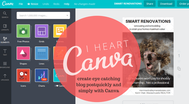
Today there are a ton of free sites allowing you to create eye catching graphics quickly and simply. The site I happen to use is Canva.
Canva ha pre-formatted layouts for all your social media sites as well as providing different tpe templates, backgorunds, elements and more. They also have a free library of graphics to add to your photos as well as being able to purchase their premium graphics and photos for a $1.00.
When it comes to photos, the first thing I must warn you is do not use any photo you have not been given the rights to use. You must seek out creative common photos or buy the usage.
I use either Adobe Stock or Big Stock. I buy 10 pack usage rights at a time and just buy more when I run out. The image cost a few dollars a piece and are roylaty free. I do not have to worry about attributaion or copyrights.
A harder way is to seek out images that you are free to use thru a creative commons license. Some are free to use as you wish, others you have to give attribution and a link back to the creator.
I find seeking out free photos tedious and time consuming as well as the quality not being as good as a purchased stock photo.

When creating graphics for a blog article try and make sure the graphic is descriptive as well as the copy. I want a viewer to quickly be able to determine what they will find in the content of the article.
Canva or an equivalent site will certainly make creating your blog graphics quick and simple.
Don’t Forget to Market Your Content
Now you have great content with eye-catching blog graphics. But don’t stop there make sure you are promoting your content on all of your social media channels.
It is critically important to become social, when marketing your blog content. One great article a week with multiple graphics should keep you busy all week promoting your content.
When you provide a great graphic along with your article promotion you will find that more people are willing want to share it.
Also, think about going back to some of your old articles with poor or no graphics and giving them a refresh with new graphics. Now you have refreshed content to promote all over again. You can constantly shake things up by altering your graphics and create new images to share along with the same article.
Summary
Remember social media and the internet is visual. The blog graphics will capture a viewer’s attention as well as making your content more shareable.
Don’t make your supporting graphics to your article an afterthought. It should be a critical piece of your overall content marketing and time should be spent on creating the images for your post.
Its Time Your Blog Post Got GRAPHIC was written by Kevin Vitali, a Tewksbury MA Real Estate Agent servicing Northeastern Massachusetts.
Want more great real estate advice from your fellow agents?


